Tickers

Fund Flow

Thursday 21 September 2017

Steel SHFE Chart Analysis

There are many negative bearish reports on Chinese steel markets publicized by the Chinese media and western media, however there is a conflicting message shown as compared to technical analysis, known as TA shows Chinese steel markets are undergoing a short term correction. Currently global financial markets are on a bullish mode and it does show conflicting message with a bearish views on Chinese steel markets because of oversupply, overcapacity glut inventory level, couple with the Chinese Authority are implementing environmental friendly policy measure to ease the air pollution of coal driven, hence temporary suspend construction activity in the 1st tier city.

http://www.mining.com/iron-ore-price-drops-chinese-steel-begins-pile/

http://www.mining.com/iron-ore-price-drops-70/

http://www.mining.com/iron-ore-price-craters-2/


After recent Federal Reserve US Central Bank announcement that they are going to rate hike 1 more time this year and projected 3 times more next year signal a shift to drain liquidity from and financial markets on the backdrop of weaker US dollar spot performance.where commodities currencies and commodities are inversely related to US dollar fundamental indicator. Should US dollar rise commodities and commodities currencies fall, should US dollar fall commodities or commodities currencies rise.

TA suggests that the upside is yet over, which is a short term correction from Aug 2017 high.

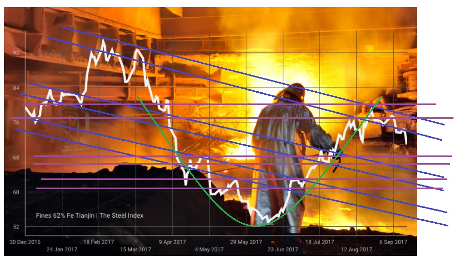
In June 2017 Iron Ore rally for a short span of 2 months into Aug 2017, from June 2017 low of 52 price to hitting Aug 2017 high of 78 to 80 price level.

1) Blue color lines refer to downtrend line or price channel line resistance.
2) Purple color lines refer to claasical support neckline couple level of support.
3) Green color line refers to U shape curve rounding bottom chart pattern.

Iron Ore Chart from Mining.com - 16 Sept 2017

 Iron Ore Chart from Mining.com - 20 Sept 2017

Iron Ore Chart from Mining.com - 21 Sept 2017

SGX SIMEX IRON ORE FUTURES w TA - 20 September 2017


Shanghai Future Exchange Steel Rebar Future Monthly Chart - 15 September 2017


Latest Steel Rebar Chart from www.mysteel.net


Shanghai Future Exchange Steel Hot Roil Coil Future Monthly Chart w TA - 15 Sept 2017


Disclaimer: All news, information and charts shared is purely by my research and personal views only. This is not a trading recommendation or advice but on the basis of sharing information and educating the investment community. Different traders and investors adopt different trading strategies and risk management approach hence if in doubt please approach or seek clarifications with your Financial Adviser, Broker and Banker.

Monday 18 September 2017

USDCAD Chart Analysis

Forex pair USDCAD closely track crude oil WTI performance, where crude oil WTI price rise will see this forex pair sell off in price level, inversely related to Crude Oil WTI. 
  
Research taken from Investopedia "The USD/CAD is affected by factors that influence the value of the U.S. dollar and/or the Canadian dollar in relation to each other and other currencies. For this reason, the interest rate differential between the Federal Reserve (Fed) and the Bank of Canada (BoC), will affect the value of these currencies when compared to each other. When the Fed intervenes in open market activities to make the U.S. dollar stronger, for example, the value of the USD/CAD cross will increase because it will take more Canadian dollars to purchase the stronger U.S dollar." 
  
  
Based on TA 
  
Weekly Chart is observed with 
  
1) head and shoulder chart patterns illustrated in orange color lines couple with double top using black color uptrend line as a guide, broken down of ascending triangle chart pattern using brown color line couple with black color uptrend line. 
  
2) swing setup had been spotted with purple color line target of possible 1.11 lower end of brown color line, possible support at 1.10 using blue color line as reference. 
  
Monthly chart suggests medium to long term price target range of 1.06 to 1.11 (estimate) box in yellow rectangle. Possible treacherous back test black color downtrend line as support which is around 0.9 to 0.99 2nd yellow rectangle (estimate) price level. There is also a falling wedge chart which could see short term rebound.
  
Drawing reference from Crude Oil (WTI) chart 
1) year 2002 USDCAD reach price level 1.60 which is Crude oil price level around 20 price level. 
2) year 2008 USDCAD reach price level 0.9 which is Crude oil price level around 147 price level. 
3) year 2009 USDCAD reach price level 1.30 which Crude oil price level reach year 2009 low of 33.50 after hitting all time high of 147 prices in year 2008. 
4) year 2016 Crude Oil hit all time low of 26.05 where USDCAD price reach around 1.45 to 1.46 (estimate). 
5) Based on TA projection if Crude oil WTI price level is satisfied at price level 75 to 90 could see USDCAD reach price 1.05 to 1.11 range. 
  
USDCAD Weekly Chart 


 USDCAD Weekly Chart w TA 


 USDCAD Monthly Chart 


 USDCAD Monthly Chart w TA 


USDCAD Monthly Chart w TA Explanations 


Disclaimer: All news, information and charts shared is purely by my research and personal views only. This is not a trading recommendation or advice but on the basis of sharing information and educating the investment community. Different traders and investors adopt different trading strategies and risk management approach hence if in doubt please approach or seek clarifications with your Financial Adviser, Broker and Banker.

Thursday 14 September 2017

Wheat Chart Analysis

Commodities wheat is the market leader of all soft commodities, wheat is used as an ingredient for most type of food process. Wheat is consumed and remain the important food source of most geographic location of the western and eastern region. 
  
Base on Technical Analysis (TA) 
  
All time high in year 2008 is 1380 (est), year 2016 low is around 380 (est). 
  
It is observed there are 3 important classical support illustrated in blue color lines, black color downtrend line connects with the lower band blue color classical support line form a descending triangle chart formation, it had since broken out of downtrend line testing the black color downtrend line previous resistance as support. Purple color lines illustrated refer to double bottom chart formation. it should retest 2012 high estimate around 1000 price level to fulfill price channel movement. 

Weat Monthly Chart 


Reference  


Disclaimer: All news, information and charts shared is purely by my research and personal views only. This is not a trading recommendation or advice but on the basis of sharing information and educating the investment community. Different traders and investors adopt different trading strategies and risk management approach hence if in doubt please approach or seek clarifications with your Financial Adviser, Broker and Banker.